# 快速入门
This is a responsive email
这是一封响应式电子邮件

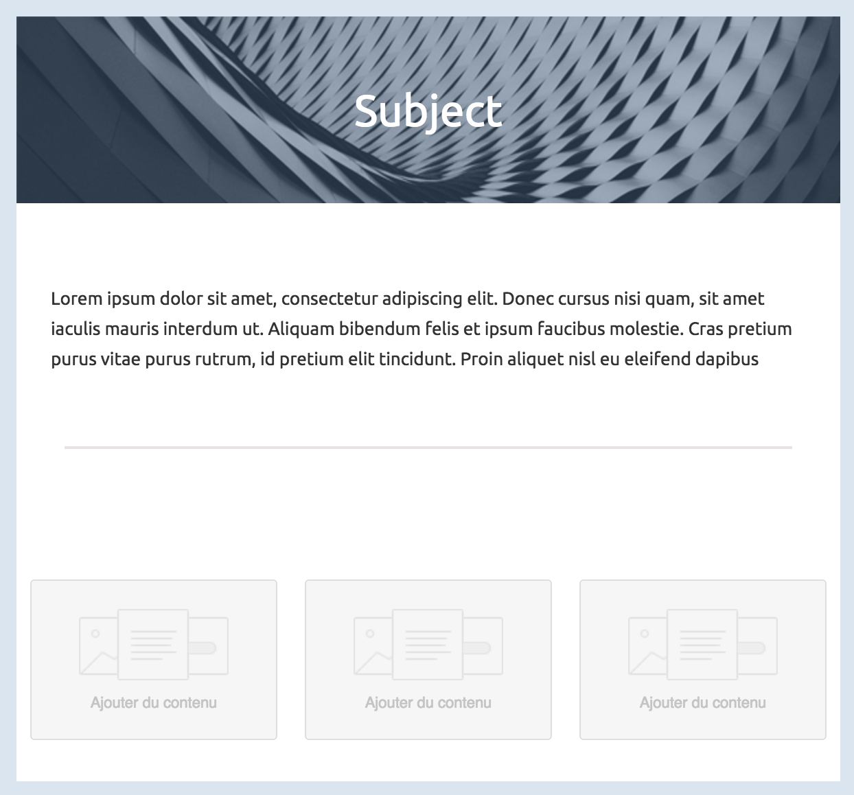
Like a regular HTML template, we can split this one into different parts to fit in a grid.
就像普通的 HTML 模板一样,我们可以将它分成不同的部分,以便适应网格布局。
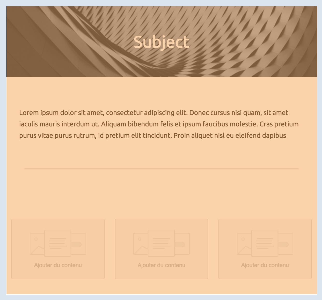
The body of your email, represented by the mj-body tag contains the entire content of your document:
您的电子邮件正文,由 mj-body 标签表示,包含您文档的全部内容:

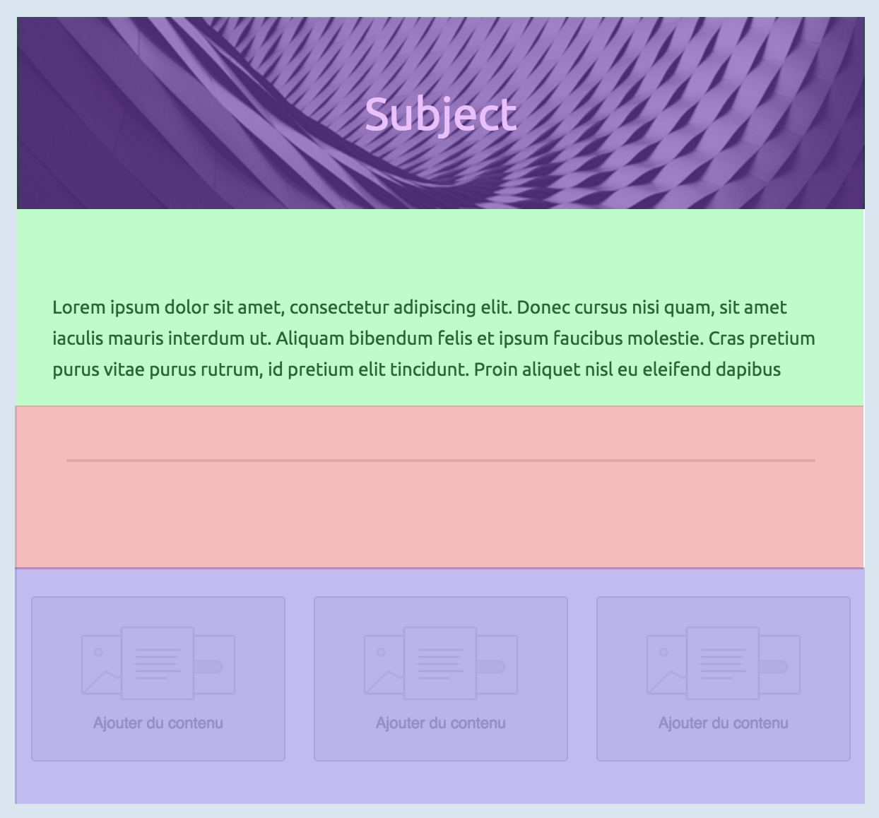
From here, you can first define your sections:
首先,您可以在这里定义您的各个部分:

Inside any section, there should be columns (even if you need only one column). Columns are what makes MJML responsive.
在任何部分中,都应该有列(即使只需要一列)。列是 MJML 实现响应式布局的关键所在。

Below, you'll find some basic rules of MJML to keep in mind for later. We'll remind them when useful but better start learning them early on.
下面列出一些 MJML 的基本规则,供您日后参考。我们会在需要的时候提醒您,但最好尽早学习。
# Column sizing 自动列宽
The default behavior of the MJML translation engine is to divide the section space (600px by default, but it can be changed with the width attribute on mj-body) in as many columns as you declare.
MJML 翻译引擎的默认行为是将部分空间(默认为 600px,但可以通过 mj-body 的 width 属性进行更改)分成您声明的列数。
WARNING
Any mj-element included in a column will have a width equivalent to 100% of this column's width.
列中包含的任何 mj 元素的宽度将等于该列宽度的 100%。
Let's take the following layout to illustrate this:
让我们以下面的布局为例来说明这一点:
<mjml>
  <mj-body>
    <mj-section>
      <mj-column>
        <!-- First column content -->
      </mj-column>
      <mj-column>
        <!-- Second column content -->
      </mj-column>
    </mj-section>
  </mj-body>
</mjml>
Since the first section defines only 2 columns, the engine will translate that in a layout where each column takes 50% of the total space (300px each). If we add a third one, it goes down to 33%, and with a fourth one to 25%.
由于第一部分只定义了两列,引擎会将其转换为每列占总空间 50%(每列 300 像素)的布局。如果添加第三列,则每列占比降至 33%,添加第四列则降至 25%。
# Manual sizing 指定列宽
You can also manually set the size of your columns, in pixels or percentage, by using the width attribute on mj-column.
您还可以通过 mj-column 的 width 属性手动设置列的大小(以像素或百分比为单位)。
Let's take the following layout to illustrate this:
让我们以下面的布局为例来说明这一点:
<mjml>
  <mj-body>
    <mj-section>
      <mj-column width="200px">
        <!-- First column content -->
      </mj-column>
      <mj-column width="400px">
        <!-- Second column content -->
      </mj-column>
    </mj-section>
  </mj-body>
</mjml>